Fall 2025 Color Story
August 19 2024
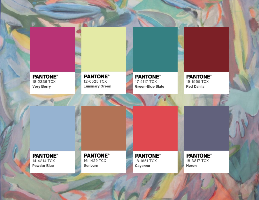
The color palette for Autumn/Winter 25/26 reflects the pressing realities of the climate crisis, characterized by an unsettling, yet vivid mixture of hues that mirror both the beauty and turmoil of our changing environment. Eerie orange skies dominate the spectrum, symbolizing the alarming shifts in our atmosphere, while unusual green waters evoke a sense of unease and ecological imbalance. This unpredictable backdrop is further enhanced by dusky purples, which introduce a layer of depth and complexity, capturing the essence of twilight—a time of transition that embodies both hope and uncertainty. Deep earth tones like rich browns and terracotta provide stability, reflecting our foundational connection to the soil. Icy pastels and muted blues evoke the unpredictability of weather changes, promoting introspection amidst chaos. Meanwhile, vibrant neon accents infuse energy and urgency, motivating individuals to respond to environmental challenges. Together, these colors articulate a narrative of swift transformations, balancing vibrancy with poignancy, as they invite contemplation on our relationship with nature amid its fluctuations.
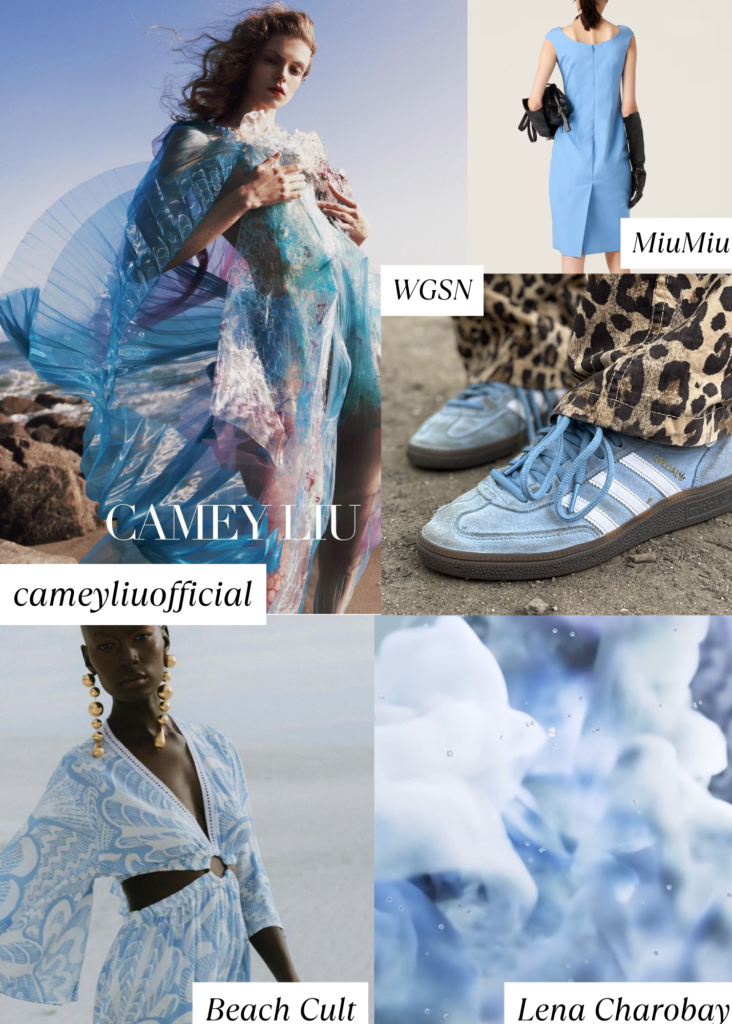
Icy Pastels and Muted Blues
To echo the unpredictable shifts in weather patterns, the palette could incorporate icy pastels—soft, cool colors that remind us of glaciers and melting ice caps. Muted blues, reminiscent of stormy seas and faded skies, can evoke a sense of calm amid chaos, reflecting the dual nature of fear and hope. These colors can encourage serenity and introspection within the chaos, inviting individuals to ponder the broader implications of climate change.
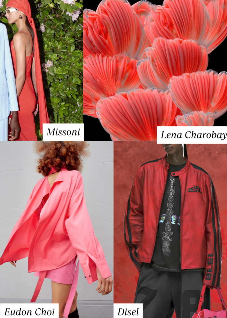
Eerie Orange Tones
Inspired by the unsettling orange skies seen during wildfires and other environmental disturbances, this color represents not only danger but also a transformative possibility. These hues can range from muted rust and burnt orange to vibrant copper, serving to create a visual dialogue that speaks to both the alarming impact of climate change and the hope for rebirth and revival. Designers may use these shades to evoke warmth or urgency, suggesting a need for immediate action.
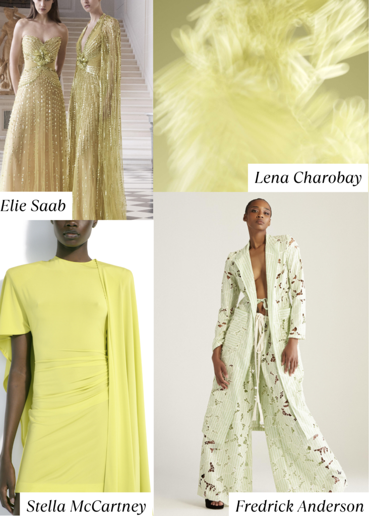
Neon Touches
As a nod to the urgent response required in our current climate, electrifying neon accents—bright pinks, greens, and yellows—could be strategically used to inject energy and vitality into the palette. These shades symbolize innovation and action, urging consumers to be part of the solution while recognizing the urgency of the challenges we face.
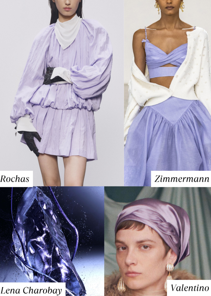
Celestial Purple
Dusty purple evokes a sense of nostalgia while simultaneously symbolizing a delicate resilience amidst the chaos. This muted hue channels the essence of twilight skies, offering a soft yet profound reminder of transitions—both natural and emotional. The subdued tone reflects the subtle beauty of nature’s transformations, drawing from the lavender fields that once thrived but now stand as solemn reminders of environmental shifts. This color offers a poignant balance within the palette, grounding the more intense hues and reflecting a profound understanding of both loss and renewal in our ongoing environmental journey.

Unusual Green Waters
The strange greens reflected in polluted or algae-filled waters serve as a reminder of nature’s fragility. These colors may appear as murky olive and jade, representing decay and renewal. The inclusion of these greens in the palette signifies a connection to nature and the essential balance necessary for sustainability. They evoke a sense of alertness to the urgent need for ecological preservation and encourage consumers to connect with the natural world in their choices.
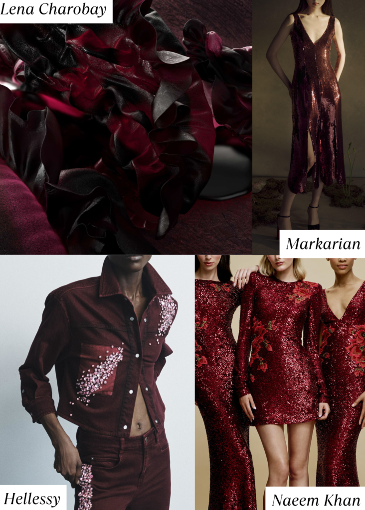
Cherry Lacquer
This rich, saturated hue of deep red resonates with a sense of passion and urgency, reminiscent of the vibrant leaves of autumn and the blood that symbolizes life and vitality. It evokes the emotional intensity of our current climate discourse—reflecting both the anger stemming from inaction and the fervor of those championing change. The depth of this color not only conveys a sense of alertness but also serves as a reminder of the sacrifices made in the battle for a sustainable future.
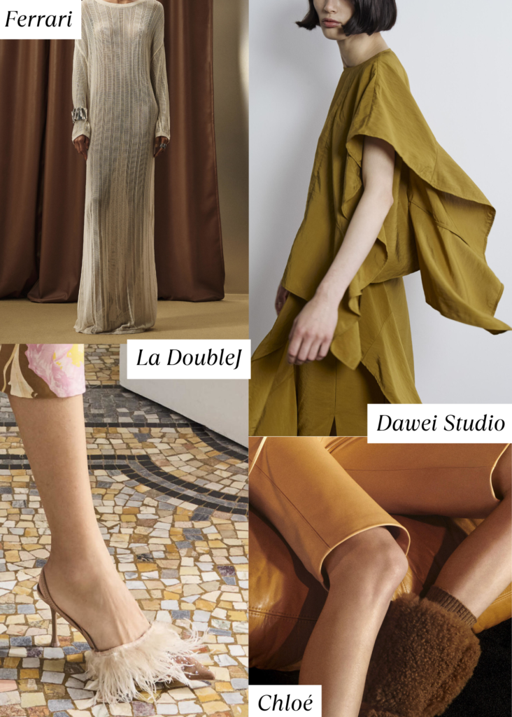
Terracotta Tones
This season contains vibrant terracotta hues, ranging from soft, sun-baked clay to deep, and fiery orange-reds. These colors evoke the earthy warmth of ancient landscapes and underline the importance of reconnecting with our roots. The terracotta palette serves as a reminder of both the vulnerability and strength of our planet, reflecting the urgent need to preserve its beauty while celebrating the transformative potential of change.

Comments (1)
ati
August 19, 2024 at 2:30 pm
We are excited to see how these colors will be used in the upcoming season!